Brand Overview
Legendary Arena is a competitive deck-building game where mastery — not luck — determines victory.
Players assemble a team of heroes, build synergy, and overcome escalating scenarios driven by a mastermind villain. Every decision compounds. Every card matters. The system rewards knowledge, sequencing, and execution.
This page defines the visual and interaction system that carries that identity across every surface.
Mission
To build the definitive, faithful, digital home for the greatest cooperative deck-building experience ever created — engineered to last, funded in a way that protects the vision forever, and designed to send real value back to the creators who make it possible.
Vision
Legendary Arena becomes not only a place to play, but a training ground for mastery — where excellence is measurable, replayable, and earned.
Slogan
Mastery — not luck — determines victory.
The brand in 30 seconds
Legendary Arena is the digital adaptation of the Legendary deck-building game. You recruit heroes, build synergy, and face escalating scenarios driven by a mastermind villain. There is no luck gate, no grind treadmill, no pay-to-win shortcut. The game measures how well you played — not how long or what you unlocked. A PAR-based scoring system makes skill visible, improvement measurable, and every scenario worth revisiting with intention. Every game is replayable, every score is verified, and competition is earned through demonstrated mastery.
Brand themes
Four themes define the emotional territory of Legendary Arena:
- Mastery — skill is the only currency; victory is earned
- Heroism — saving lives outweighs playing it safe; the scoring system rewards courage over caution
- Escalation — difficulty compounds; every decision echoes forward through the scenario
- Integrity — fairness is structural, not moderated; replays are deterministic, scores are transparent, and the system never lies
Emotional framework
The brand should make people feel:
- Accomplishment — “I earned this”
- Agency — “My decisions mattered”
- Respect — “This system treats me as a capable player”
- Aspiration — “I can get better at this”
The brand must never make people feel manipulated, lucky, or patronized.
Start Here
Legendary Arena’s visual identity is a token-driven design system
shared across three surfaces. All styling resolves through
/brand-tokens.css — no raw hex, no ad-hoc
typography. This page is the single reference for using the system.
One rule: every visual value resolves through var(--la-*).
The canonical source lives at
docs/brand/*.md in the repo.
The Game
Legendary Arena is a digital adaptation of the Legendary deck-building game. Players assemble a team of heroes, face escalating scenarios driven by a mastermind villain, and earn standing through demonstrated mastery — not luck, not grind.
The core loop: recruit heroes, build synergy, defeat the mastermind. Every card in a player’s deck is a deliberate choice. The game rewards knowledge of card interactions and sequencing over randomness.
Four properties carry the brand across the product:
www.legendary-arena.com— marketing, brand page, blogplay.legendary-arena.com— live game clientcards.barefootbetters.com— card registry and browsingewiki.legendary-arena.com— engineering wiki (architecture, decisions, inventory)
The first three consume the same token system
(/brand-tokens.css) so the visual language
is consistent across every surface a player touches. The engineering
wiki is governed by the engine monorepo and is not a brand-tokens
consumer in v1.
Logo + Identity
Primary — gold on dark
Inversion — white-only
Use only when a light surface forces inversion.
Icon / favicon
Non-negotiable rules
- Do not recolor the logo
- Do not apply gradients or effects
- Do not apply class colors (
--la-color-class-*) — class colors communicate gameplay role, not brand identity (seepalette.md§4.4) - Do not alter proportions
Violation weakens brand recognition immediately.
Core Identity (Narrative)
Brand voice: cinematic, mature, heroic. Direct sentences, active
verbs, no irony — see strategy.md §2 for the full
voice + tone rules.
Words to avoid
These terms contradict the brand’s identity and must not appear in any brand-facing copy, UI text, or marketing surface:
| Avoid | Why | Use instead |
|---|---|---|
| luck, RNG, random | Implies outcome is uncontrolled | skill, mastery, decision |
| grind, farm, repeat | Implies value comes from volume | refine, improve, revisit |
| loot, gacha, pack | Implies randomized purchase | content, expansion, set |
| pay-to-win, premium advantage | Violates non-goal NG-1 | cosmetic, supporter, presentation |
| addictive, hooked | Implies exploitation | compelling, rewarding, deep |
| casual | Dismissive of player investment | accessible, approachable |
| meta, tier list | Implies solved optimization | strategy, composition, approach |
Positioning
Legendary Arena is a skill-driven strategy system disguised as a card game.
- Not luck-driven
- Not grind-based
- Not collection-gated
Victory is earned through system mastery. The scoring system measures how well a game was played — never how long, how often, or what was unlocked.
Identity colors
Three colors define brand recognition — constraint is intentional:
- Gold — achievement, recognition, victory
- Maroon (deep, not cherry) — action, CTAs, decisive moments
- Navy (deep, not royal) — system, structure, navigation
Additional color reduces signal strength.
Class colors are gameplay-only. The five class tokens
(--la-color-class-{strength,covert,instinct,ranged,tech}) identify a
hero’s gameplay class on chips, filters, deck-builder, and class
borders — never brand surface, never CTA, never logo. They appear
inside the §Color System collapsible with the gameplay-only
annotation.
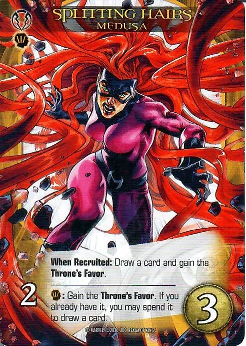
Card Graphics
The game’s visual vocabulary includes three icon families used on cards, filters, and the deck-builder UI. All icons are SVG, designed to read clearly at 24px and scale to 64px+.
Card typography
Two fonts appear on cards and card-adjacent UI. These are game-specific — separate from the web token system’s three locked families (Bebas Neue / Inter / JetBrains Mono).
Bangers — all 40 card-set SVGs reference this font for the expansion abbreviation text. Bold, comic-style letterforms that stay legible at small icon sizes.
Eurostile Condensed — the closest match to the physical card’s title and body text. Clean, technical condensed weight that carries the card UI’s precise feel.
Neither font is part of brand-tokens.css — they live in the game
asset pipeline, not the cross-site token contract.
Hero classes (5)
Each hero belongs to one of five gameplay classes. Class icons appear on hero cards, filter chips, and class-border treatments. Class colors are gameplay-only — see §Core Identity.
Hero teams (25)
Team icons identify hero affiliations — Avengers, X-Men, Guardians of the Galaxy, etc. They appear on hero cards and team-filter UI.
Card sets (40)
Set icons identify which expansion a card belongs to. They appear on card faces and in set-filter dropdowns.
All 40 card-set icons
Why This System Exists
The brand system enforces four properties:
- Consistency — one visual language across all surfaces
- Scalability — new features inherit design automatically
- Velocity — design decisions are pre-encoded in tokens
- Integrity — brand cannot drift over time
The token layer is not styling — it is governance encoded as code.
Color System
Visual summary first; the full per-mode spec (with class colors) lives in the collapsible below.
How to think about color
| Category | Purpose |
|---|---|
| Identity | Recognition surfaces — gold, maroon, navy |
| Action | Interaction and CTA — what the user clicks |
| System | Layout and readability — backgrounds, text, borders |
Palette reference (light + dark)

Visual summary
Identity (brand-recognition surfaces)
Action (CTA / interactive)
System (surface / text)
System colors must never compete with identity colors.
--la-color-cta is mode-stable at #7a1d1f (~10.4:1 contrast on
white text in both modes — AAA). --la-color-blue-bright carries
interactive affordance; the deeper --la-color-blue base reads
decorative on its own (see
palette.md §4.3).
Full color spec (supporting neutrals, semantics, class colors)
Backgrounds + surfaces
Text + borders
Brand colors — full scale (each has bright + muted siblings)
Semantic states
Error red (--la-color-error, pure-red family) must remain
visually distinct from CTA red (maroon family) in both modes —
palette.md §5.3.
Class colors — gameplay-only. These tokens identify a hero’s gameplay class on chips, deck-builder selection, filter states, and class borders. Not brand identity — must not appear as brand-page surface, CTA, system semantic, marketing, or logo.
Typography System
Three locked families carry the type system. The display face is used sparingly for hero / H1 / H2 only; body is the default for everything readable; mono is reserved for code, registry, and card-stat surfaces.
Bebas Neue — display
Condensed, high-impact, uppercase-friendly. Used for hero, H1, and H2 only — never body text. Fallbacks: Anton, Oswald, system-ui.
Effect: impact, cinematic scale, authority.
Inter — body
Highly readable at all sizes, neutral tone. The default for everything readable — paragraphs, navigation, UI. Fallbacks: system-ui, -apple-system, Segoe UI.
Effect: clarity, neutrality, readability.
JetBrains Mono — mono
Code blocks, card stats, token references, technical content. Fallbacks: IBM Plex Mono, Consolas.
Effect: precision, technical clarity.
Full font stacks in
typography.md §3.
Type scale — live samples
Each sample below renders at its actual size, weight, and font. Hero / H1 / H2 use the display face (Bebas Neue) in uppercase; H3-H6 and body use the body face (Inter) in sentence case.
Full typography spec (size scale, weights, letter-spacing)
The rem-based scale uses 16px as its base. Each role has a paired
size + line-height + weight token in static/brand-tokens.css.
| Role | Font | Size token | Size | Line-height token | Weight token |
|---|---|---|---|---|---|
| Hero | Bebas Neue | --la-font-size-hero | 3.5rem / 56px | --la-line-height-hero (1.05) | --la-font-weight-h1 (700) |
| H1 | Bebas Neue | --la-font-size-h1 | 3rem / 48px | --la-line-height-h1 (1.1) | --la-font-weight-h1 (700) |
| H2 | Bebas Neue | --la-font-size-h2 | 2.25rem / 36px | --la-line-height-h2 (1.15) | --la-font-weight-h2 (700) |
| H3 | Inter | --la-font-size-h3 | 1.75rem / 28px | --la-line-height-h3 (1.2) | --la-font-weight-h3 (600) |
| H4 | Inter | --la-font-size-h4 | 1.375rem / 22px | --la-line-height-h4 (1.3) | --la-font-weight-h4 (600) |
| H5 | Inter | --la-font-size-h5 | 1.125rem / 18px | --la-line-height-h5 (1.4) | --la-font-weight-h5 (500) |
| H6 | Inter | --la-font-size-h6 | 1rem / 16px | --la-line-height-h6 (1.5) | --la-font-weight-h6 (500) |
| Body | Inter | --la-font-size-body | 1rem / 16px | --la-line-height-body (1.6) | --la-font-weight-body (400) |
| Small | Inter | --la-font-size-small | 0.875rem / 14px | --la-line-height-small (1.5) | --la-font-weight-small (400) |
| Mono | JetBrains Mono | --la-font-mono | 1rem / 16px | --la-line-height-body (1.6) | 400 |
Hero / H1 / H2 use uppercase with the display letter-spacing token
(--la-letter-spacing-display, 0.04em); H3-H6 and body remain in
sentence case. Body text must not drop below 14px anywhere it’s
expected to be readable.
Reality check
Typography is not decoration. It encodes hierarchy, information priority, and tone. Misuse breaks comprehension before it breaks aesthetics.
Spacing & Layout
The spacing scale uses an 8-point base with 9 named steps. All
layout spacing resolves through --la-space-* tokens — spacing
defines rhythm, not just distance. Full spec in
spacing.md.
--la-space-1 4px--la-space-2 8px--la-space-3 12px--la-space-4 16px--la-space-5 24px--la-space-6 32px--la-space-7 48px--la-space-8 64px--la-space-9 96pxBorder radius — --la-radius-sm (4px), --la-radius-md (8px),
--la-radius-lg (16px), --la-radius-xl (24px),
--la-radius-pill (9999px).
Z-index layers — base (0), dropdown (5), sticky (10),
overlay (50), modal (100), toast (200).
Rule: tight spacing = density / system. Wide spacing = emphasis / separation. Never introduce arbitrary pixel values.
Interaction Patterns
Interactive elements follow a consistent set of transition and
state rules defined in brand-tokens.css.
Transitions — three speeds, all ease-in-out:
--la-transition-fast— 120ms (hover, focus ring, toggle)--la-transition-base— 180ms (expand/collapse, tab switch)--la-transition-slow— 280ms (page-level reveal, modal)
Hover states — surface elements lift to --la-color-surface-hover;
interactive text shifts to --la-color-blue-bright.
Focus — visible focus rings use --la-color-blue-bright at 2px
outline offset. Never suppress the default outline without replacing
it.
Reduced motion — all transitions respect prefers-reduced-motion: reduce. When active, duration collapses to 0ms. See
spacing.md §10.
Rule: interaction must feel responsive, predictable, and controlled. Never decorative. Always meaningful.
Accessibility
Accessibility is built into the token system, not bolted on.
Contrast requirements:
- Body text on all background tokens must meet WCAG AA (4.5:1).
- Large text (display / H1 / H2) must meet WCAG AA large (3:1).
--la-color-ctaon white text exceeds AAA (~10.4:1) in both modes — mode-stable by design.--la-color-text-secondaryon--la-color-bg-primaryclears AA in both modes (light: 7.1:1, dark: 6.8:1).
Color independence: information must not be conveyed by color
alone. Semantic states (success, warning, error) pair color
with icon or text label.
Minimum text size: body text must not drop below 14px
(--la-font-size-small) anywhere it is expected to be readable.
Motion: all animation respects prefers-reduced-motion. No
auto-playing animation without user trigger.
Focus management: interactive elements must have a visible focus
indicator. The system default is a 2px --la-color-blue-bright
outline.
Token Contract
All visual styling MUST consume the canonical tokens defined in
/brand-tokens.css. No raw hex values. No
ad-hoc typography. All consumers (www.*, play.*, cards.*)
consume tokens via cross-origin link.
Governance lineage: WP-002 locked the v1 token surface
(breaking changes require v1 → v2 + coordinated consumer
updates); WP-006 deployed /brand-tokens.css with cross-origin
headers; WP-007a / WP-007b wired the play client and registry
to consume tokens cross-origin with a bundled fallback per consumer.
/brand-tokens.css is a public API — treat any proposed token
change as an API change.
Copy-paste patterns
Primary CTA button:
.btn-primary {
  background-color: var(--la-color-cta);
  color: #fff;
  font-family: var(--la-font-body);
  font-weight: var(--la-font-weight-semibold);
  padding: var(--la-space-3) var(--la-space-5);
  border: none;
  border-radius: var(--la-radius-md);
  transition: background-color var(--la-transition-fast);
}
.btn-primary:hover {
  background-color: var(--la-color-cta-bright);
}
.btn-primary:focus-visible {
  outline: 2px solid var(--la-color-blue-bright);
  outline-offset: 2px;
}
Section card:
.card {
  background-color: var(--la-color-surface);
  border: 1px solid var(--la-color-border-subtle);
  border-radius: var(--la-radius-md);
  padding: var(--la-space-5);
  transition: background-color var(--la-transition-fast);
}
.card:hover {
  background-color: var(--la-color-surface-hover);
}
Display heading:
.hero-heading {
  font-family: var(--la-font-display);
  font-size: var(--la-font-size-hero);
  font-weight: var(--la-font-weight-h1);
  line-height: var(--la-line-height-hero);
  letter-spacing: var(--la-letter-spacing-display);
  text-transform: uppercase;
  color: var(--la-color-gold);
}
Consuming tokens cross-origin (play / registry):
<link rel="stylesheet"
      href="https://www.legendary-arena.com/brand-tokens.css"
      crossorigin="anonymous" />
Each consumer bundles a local fallback copy of brand-tokens.css
that loads if the cross-origin fetch fails — see WP-007a / WP-007b.
Usage Guidelines
Bright lines from
strategy.md §10
-
DO use
--la-color-blue-brighton interactive elements — links, focus rings, hover, active. The deeper navy base reads decorative. -
DO use
--la-color-ctafor primary CTA backgrounds — mode-stable, AAA on white text. - DO render the logo as gold-on-dark (primary) or white-only (inversion). Two treatments only.
- DO pair semantic states with icons or text labels — never color alone.
-
DO provide a visible focus indicator on every interactive element —
2px --la-color-blue-brightoutline. -
DON'T use class colors (
--la-color-class-*) for branding, marketing, CTAs, or the logo. Gameplay tags, not identity. -
DON'T reuse brand red (
--la-color-red/-cta, maroon family) as an error state. Error uses--la-color-error(pure-red family). -
DON'T introduce raw hex / font / spacing values. Every visual resolves through
var(--la-*). - DON'T suppress the default focus outline without providing an equivalent visible alternative.
-
DON'T auto-play animations or transitions that ignore
prefers-reduced-motion.
Assets & Downloads
Token stylesheet — /brand-tokens.css
(the canonical source; link or download).
Logo files (SVG, production-ready):
Documentation (source of truth, in repo):
strategy.md— positioning, voice, tonepalette.md— full color spec + WCAG contractstypography.md— font families, size scalespacing.md— spacing, radii, z-index, motionCHANGELOG.md— token version history
Engineering references (engine monorepo):
- Architecture inventory — auto-generated weekly from
scripts/architecture-inventory.mjs(WP-145) - Engineering wiki — decisions, post-mortems, schema docs
Real-World Application
The system must produce consistent results across all surfaces.
- Same CTA color on marketing and game UI
- Same type hierarchy across pages
- Same spacing rhythm across layouts
If two surfaces feel different, the system is being violated.
Art Direction (Mood Board)
This is the art-direction brief used when commissioning the
one-page Legendary Arena mood board poster. Artists, partners, and
integrators use it to interpret the brand consistently. The
canonical source is
docs/brand/mood-board-spec.md;
the body is inlined below at render time so a single edit
propagates.
Full art-direction brief (mood board spec)
This is the art-direction brief used when commissioning the
one-page Legendary Arena mood board (PDF/SVG). It is rendered as
Section 8 of /brand/ and remains the source of truth when
re-engaging an artist. The poster artwork itself is out of
scope — when commissioned, it lands at
static/brand/mood-board.{pdf,svg} and is referenced from
Section 8 via a download link or inline embed (separate WP).
Below is a single-page mood board spec (PDF/SVG) you can hand to a graphic artist so they understand Legendary Arena’s look, feel, and message at a glance. Pattern: one-page brand board / brand guideline poster (logo + palette + type + imagery + texture + do/don’t).
1) Mood board goal (top-of-page micro-brief)
Header title (large): LEGENDARY ARENA — MOOD BOARD (ART DIRECTION)
One-sentence promise (beneath title): “Legendary Arena is a modern deck-building arena: strategic, collectible, heroic — crafted for fast readability and bold moments.”
3 brand pillars (short phrases):
- Strategy → Synergy → Power spikes
- Mythic spectacle, modern clarity
- Collectible craft, digital smoothness
Why this belongs: one-page boards work best when they anchor “purpose + vibe” before showing visuals, so artists interpret images consistently.
2) Layout: a proven one-pager structure (what blocks to include)
Use a grid-based poster that shows essentials without scrolling — typical of single-page brand guideline posters.
Recommended grid (simple + scannable)
- Top row (full width): Brand header + tagline + keywords
- Middle (3 columns):
- Left: “Words & rules” (keywords, tone, do/don’t)
- Center (largest): Image collage (the “mood”)
- Right: System (color, type, shapes, textures, icons)
- Bottom row (full width): Signature motif strip + UI/card framing snippet + credits/links
This mirrors widely used brand-board templates that combine logo, imagery, palette, typography, and quotes in one view.
3) The exact text blocks to include (copy-paste ready)
A) “Brand in 6 words” (upper-left)
Pick one line (or include 2 options):
- “Build decks. Trigger combos. Become legendary.”
- “Collect power. Craft synergy. Win the arena.”
- “Modern strategy with mythic spectacle.”
B) Brand personality keywords (left column)
Primary adjectives (5): Legendary, Strategic, Bold, Clean, Premium
Secondary adjectives (5): Energetic, Competitive, Collectible, Satisfying, Modern
Avoid (3-5): Goofy, cluttered, grimdark, muddy, generic fantasy
(“Avoid” lists are common in brand guides because they prevent drift when multiple artists contribute.)
C) Tone-of-voice micro rules (left column)
- Write like: confident, punchy, invitational.
- Use verbs: build, forge, unleash, rally, command.
- Never: cynical, snarky, overly ironic.
D) Audience + feeling (left column)
- Audience: deck-building / strategy players who enjoy collection and mastery.
- Desired feeling (in order): curiosity → control → momentum → triumph.
E) “Design intent” bullets (left column)
- Readability first: every card / UI element must read in 1-2 seconds.
- Iconic silhouettes: heroes / units look recognizable even small.
- Reward clarity: power moments feel bright, not noisy.
4) The graphics to include (what to show, not just tell)
A) Central image collage (the “mood”) — 9 to 12 tiles
The collage should be the largest area. Use 9-12 images arranged in a clean grid (3×3 or 4×3). Include labels on 3-5 tiles (“Lighting”, “Material”, “Composition”, “Energy”). This matches common brand-mood-board practice of gathering varied imagery that evokes the desired feeling.
What the tiles should depict (categories):
- Heroic focal portraits (high-contrast lighting, readable silhouettes)
- Arena scale / spectacle (wide scenes with a central “stage” shape)
- Card / collectible craftsmanship (foil, emboss, gilded edges — tasteful)
- Modern UI clarity (clean panels, restrained gradients, crisp icons)
- Energy effects (glows, bursts, runes — controlled, not messy)
- Material references (metal, stone, enamel, glass — premium feel)
- Color mood photography (2-3 photos that match your palette vibe)
- Typography vibe reference (a screenshot of a type pairing in use)
- Pattern / texture reference (subtle background motif inspiration)
Tip: The best mood boards include variety (photo, illustration, UI, texture) rather than only concept art, so artists grasp the full brand system.
B) Color palette block (right column)
Show 6-8 swatches with HEX codes and roles (Primary / Secondary / Accent / Neutral). Templates and guides repeatedly call out including precise palette values for consistent execution.
Recommended structure (labels you should include):
- Primary Dark (Background)
- Primary Light (Surface)
- Accent 1 (Energy)
- Accent 2 (Rarity / Reward)
- Neutral 1 (Text)
- Neutral 2 (Lines / Dividers)
(Legendary Arena has established brand colors in palette.md —
drop in the canonical swatches when populating this block. The
roles above are template labels, not new decisions.)
C) Typography block (right column)
Show two font roles and a hierarchy example: H1, H2, Body, UI Label. One-page brand boards commonly include “type pairing + usage.”
Include these lines exactly:
- Display / Logo type: (Font Name) — used for game title, big headings
- UI / Body type: (Font Name) — used for interfaces, card text
- Rules: “Max 2 families; weight does the work.”
Also include a sample sentence in both styles:
- “Forge a deck. Rally allies. Unleash a legendary turn.”
D) Shape language + composition block (right column)
Include 3-5 simple vector shapes that define the visual grammar:
- Shield / crest silhouette (identity anchor)
- Hex or diamond framing (collectible / rarity cue)
- Arc / arena ring (the “arena” motif)
- Card frame corners (signature radius + bevel)
Label it: “Shape Language: crisp geometry + heroic crest”
This aligns with guidance that a style guide should define the “visual identity system,” not just pictures.
E) Texture & material strip (bottom row)
Add a thin horizontal strip with 3 textures (subtle, premium):
- Brushed metal (cool)
- Carved stone / slate (grounded)
- Enamel glow / glass bloom (magic / energy)
Label each with a single word: METAL / STONE / GLOW.
F) Iconography mini-set (right-lower)
Add a 6-10 icon mini-grid (simple line icons, consistent stroke):
- attack / power
- recruit / craft
- shield / defense
- rarity star
- timer / turn
- lightning / energy
Label: “Icons: simple, bold, readable at 24px”
Many brand-guideline examples emphasize including icon rules for consistency.
G) “Card + UI snippet” (bottom center)
Include one small “system preview” graphic:
- A card frame mock (blank art window + title bar + cost gem + text area)
- A button set (Primary / Secondary / Disabled)
- A panel (modal or tooltip style)
Label: “System Preview (readability first)”
Game-style guidance often pairs mood boards with practical UI / system references so teams can build consistently.
5) Do / Don’t mini panel (left-lower): prevents style drift fast
DO
- High contrast focal points
- Clean silhouettes
- Controlled glow
- Premium materials
- Spacious layouts
DON’T
- Over-textured backgrounds behind text
- Rainbow gradients everywhere
- Tiny unreadable detail at card scale
- Excessive particle noise
- Mixed icon styles
Short “dos and don’ts” are common in one-page guideline posters because they communicate constraints instantly.
6) References (tiny footer): where artists can pull templates
Add a small footer line on the produced poster like:
“Layout inspired by one-page brand-guide / brand-board formats (logo + palette + type + imagery + rules). See: Milanote Brand Board, StudioBinder Brand Mood Board Template, and single-page poster collections like Graphic Design Junction.”
That gives the commissioned artist context without forcing them to read long docs.
7) Quick assembly checklist (so the final PDF/SVG is truly “instant”)
Content requirements that can sit directly on the produced poster (small text):
- Max 12 images in the collage; label 3-5 of them.
- Palette must include HEX codes + roles.
- Type must show hierarchy sample (H1 / H2 / Body / UI).
- Include 1 “system preview” (card frame + button + panel).
- Include Do / Don’t list.
Source patterns (not load-bearing standards): StudioBinder Brand Mood Board, Milanote Brand Board, Graphic Design Junction Single-Page Brand Guidelines, Milanote Game Design Moodboard, StudioBinder Video Game Mood Board, StudioBinder How to Make a Brand Mood Board, Content Harmony Great Brand Guidelines, ebaqdesign One Page Style Guide, SegmentUI Figma Kit Branding, LinkedIn — game design style guide best practices.
Doc: Legendary Arena — Mood Board Spec (Art Direction) — v1.
Additive brand doc; sibling to strategy.md, palette.md,
typography.md, spacing.md. Owner: Jeffery Jensen.
Last updated: 2026-05-11.
Facebook Graphics
Visual reference for every Facebook image format Legendary Arena needs — from page setup through content and campaigns.

Page identity (required at launch)
These two assets define how the page appears everywhere on Facebook.
Profile picture — the logo, everywhere.
| Property | Value |
|---|---|
| Upload size | 800 x 800 px (minimum 320 x 320) |
| Aspect ratio | 1:1 — displays as a circle |
| Format | PNG (transparency-safe for the logo) |
| Safe rule | Center the logo — corners crop into a circle on every surface |
Use the existing icon from /brand/logo/legendary-arena-icon.svg,
exported as PNG at 800 x 800. The gold-on-dark variant reads best
against Facebook’s white and dark-mode chrome.
Cover photo — the brand billboard.
| Property | Value |
|---|---|
| Upload size | 851 x 315 px |
| Aspect ratio | ~2.7:1 |
| Desktop display | ~820 x 312 |
| Mobile display | ~640 x 360 (crops left and right edges) |
| Safe zone | Center 640 x 312 px — keep all critical content here |
| Format | JPG for photo-heavy; PNG if text-heavy |
For Legendary Arena: logo wordmark + tagline in the safe zone, hero card art filling the background, optional CTA text (“Play Online” or “Join the Arena”). Keep the edges expendable — mobile crops ~100 px from each side.
Open Graph image (critical for sharing)
This is what appears when anyone shares a legendary-arena.com link
on Facebook (or any platform that reads Open Graph tags). Set it
site-wide via <meta property="og:image">.
| Property | Value |
|---|---|
| Size | 1200 x 630 px |
| Aspect ratio | 1.91:1 |
| Format | JPG or PNG |
The OG image should be a standalone brand card — recognizable without context. Logo, tagline, and one piece of hero art. No small text — it renders as a thumbnail in most feeds.
Feed content templates
Three standard formats cover every feed post type. Design templates for each so posts stay on-brand without per-post design work.
| Format | Size | Ratio | Use case |
|---|---|---|---|
| Square | 1080 x 1080 px | 1:1 | Card previews, hero spotlights, set reveals |
| Portrait | 1080 x 1350 px | 4:5 | Dev updates, announcements, patch notes — takes more screen space in feed |
| Landscape | 1200 x 630 px | 1.91:1 | Blog links, feature launches, site shares (OG-compatible) |
File guidance: JPG or PNG, keep under 1 MB. Facebook recompresses everything — oversized files gain nothing and load slower on upload. PNG is better for UI screenshots and text-heavy graphics; JPG for card art and photos.
Portrait gets the most feed real estate. At 4:5 it fills more of the mobile viewport than square or landscape — use it for announcements and content where visibility matters most.
Stories and Reels
| Property | Value |
|---|---|
| Size | 1080 x 1920 px |
| Aspect ratio | 9:16 (full-screen vertical) |
| Format | JPG / PNG (image), MP4 (video) |
Leave ~250 px margin at top and bottom for Facebook’s UI overlays (profile icon, reply bar, progress indicator). The content-safe area is roughly 1080 x 1420 centered vertically.
For Legendary Arena: card-of-the-day reveals, 15-second gameplay clips, set announcement teasers. Vertical format rewards bold visuals and minimal text.
Event and group covers
| Asset | Size | Ratio |
|---|---|---|
| Event cover | 1920 x 1005 px | ~1.91:1 |
| Group cover | 1640 x 856 px | ~1.91:1 |
Both share the 1.91:1 family — a single wide template scales to either. Use for game launches, online tournaments, feature releases, and community group headers.
Advertising formats
If running paid campaigns later, these are the three ad canvas sizes:
| Format | Size | Ratio | Placement |
|---|---|---|---|
| Feed ad | 1200 x 628 px | 1.91:1 | News feed, right column |
| Square ad | 1080 x 1080 px | 1:1 | Feed, Marketplace, search |
| Story ad | 1080 x 1920 px | 9:16 | Stories, Reels interstitial |
These overlap with the content templates above — square and story ads reuse the same canvases. The feed ad is 2 px shorter than the standard 1200 x 630 link preview; in practice the same template works for both.
Launch checklist
The minimum asset set to launch a complete Facebook page:
- Profile image — icon at 800 x 800 PNG
- Cover photo — brand billboard at 851 x 315
- Open Graph image — 1200 x 630 (set in site
<head>) - 3-5 starter posts — one square (card spotlight), one portrait (announcement), one landscape (site link)
Everything else (stories, event covers, ads) can follow once the page is live and the content cadence is established.
File type decision guide
| Content type | Recommended | Why |
|---|---|---|
| Logo / icon / text-heavy | PNG | Preserves sharp edges, supports transparency |
| Card art / photos / hero images | JPG | Smaller file size, no visible quality loss at 1080+ px |
| Vertical video (stories, reels) | MP4 | Native format; H.264 codec, under 4 GB |
Facebook recompresses all uploads. Exporting at high quality (JPG 90-95%, PNG-24) gives the recompressor the best source material without inflating file size past the ~1 MB practical ceiling.
YouTube Graphics
Visual reference for every YouTube image format Legendary Arena needs — from channel setup through video content and community engagement.

Channel identity (required at launch)
These two assets define how the channel appears across YouTube.
Profile picture — the logo, everywhere.
| Property | Value |
|---|---|
| Upload size | 800 x 800 px |
| Aspect ratio | 1:1 — displays as a circle (~98 x 98 in UI) |
| Format | PNG (transparency-safe for the logo) |
| Max file size | ~4 MB |
| Safe rule | Center the logo — edges crop into a circle on every surface |
Use the existing icon from /brand/logo/legendary-arena-icon.svg,
exported as PNG at 800 x 800. Identical asset as Facebook — one
export covers both platforms.
Channel banner — the most crop-hostile asset on YouTube.
| Property | Value |
|---|---|
| Upload size | 2560 x 1440 px |
| Aspect ratio | 16:9 |
| Safe area | 1546 x 423 px (center strip only) |
| Max file size | ~6 MB |
| Formats | JPG, PNG, GIF, BMP |
Device-specific crop behavior (this matters a lot):
| Device | What displays | Effective size |
|---|---|---|
| TV | Full 2560 x 1440 canvas | 2560 x 1440 |
| Desktop | Center horizontal strip | ~2560 x 423 |
| Tablet | Narrower center strip | ~1855 x 423 |
| Mobile | Safe zone only | 1546 x 423 |
Everything outside the safe zone gets cropped on every device except TV. For Legendary Arena: logo wordmark + tagline inside the safe zone, hero card art filling the background. The edges are expendable — design them to look good but carry no critical information.
Video thumbnail (highest-ROI asset)
The thumbnail is the single most important image on YouTube. It determines whether someone clicks — more than the title, more than the description. Every video needs a custom thumbnail.
| Property | Value |
|---|---|
| Size | 1280 x 720 px |
| Aspect ratio | 16:9 |
| Min width | 640 px |
| Max file size | ~2 MB |
| Formats | JPG, PNG, GIF |
Overlay constraint: the bottom-right corner is covered by the video timestamp badge (~10-15% of the frame). Keep logos, text, and CTAs out of that zone.
Design rules for Legendary Arena thumbnails:
- Bold, high-contrast visuals — thumbnails render at ~320 x 180 in most feeds
- One focal point per thumbnail (a hero card, a mastermind, a score)
- Minimal text — if text is needed, large enough to read at thumbnail scale
- Keep key content in the center ~80% of the frame
- Consistent template so viewers recognize the channel at a glance
Branding watermark (subscribe overlay)
The watermark appears as a clickable subscribe button in the bottom-right corner of every video. Set it once in YouTube Studio under Customization > Branding.
| Property | Value |
|---|---|
| Size | 150 x 150 px |
| Format | PNG (transparent background recommended) |
| Max file size | ~1 MB |
| Placement | Bottom-right corner (YouTube-controlled) |
Display timing options:
- Entire video (recommended for new channels)
- Custom start time
- End of video only
Use the LA icon on a transparent background. Keep it simple — it renders at roughly 40 x 40 px in the player, so fine detail is invisible.
Shorts (vertical video)
| Property | Value |
|---|---|
| Size | 1080 x 1920 px |
| Aspect ratio | 9:16 (full-screen vertical) |
| Format | MP4 (video), JPG/PNG (cover image) |
Leave ~200 px margin at top and bottom for YouTube’s UI overlays (channel name, like/comment buttons, description). The content-safe area is roughly 1080 x 1520 centered vertically.
For Legendary Arena: card-of-the-day reveals, 15-second gameplay clips, set announcement teasers, quick strategy tips. Vertical format rewards bold visuals and minimal text — same as Facebook/ Instagram Stories.
Community posts
| Property | Value |
|---|---|
| Size | 1080 x 1080 px (square recommended) |
| Aspect ratio | 1:1 |
| Formats | JPG, PNG |
YouTube also supports landscape images in community posts, but square gives the most consistent display across devices. Use for polls, announcements, card spotlights, and engagement content.
End screen canvas
| Property | Value |
|---|---|
| Base size | 1280 x 720 px (matches video resolution) |
| Duration | Last 5-20 seconds of the video |
| Format | Designed into the video itself |
Critical constraint: end screen elements (subscribe button, video suggestions, playlist links) are interactive overlays placed by YouTube. The video’s final frames need to leave space for these clickable zones — typically two rectangular regions in the lower two-thirds of the frame.
Design the last segment of each video with a clean background or branded end card that accommodates the overlay elements without visual collision.
Launch checklist
The minimum asset set to launch a complete YouTube channel:
- Profile picture — icon at 800 x 800 PNG
- Channel banner — brand billboard at 2560 x 1440 (safe zone tested on mobile)
- Branding watermark — icon at 150 x 150 transparent PNG
- Thumbnail template — reusable 1280 x 720 template with consistent brand treatment
- End screen template — branded end card with space for YouTube’s clickable elements
Everything else (Shorts covers, community post templates) can follow once the channel is live and the content cadence is established.
File type decision guide
| Content type | Recommended | Why |
|---|---|---|
| Logo / icon / watermark | PNG | Preserves sharp edges, supports transparency |
| Thumbnail (card art / gameplay) | JPG | Smaller file size, no visible quality loss at 1280 px |
| Thumbnail (text-heavy / UI) | PNG | Crisper text rendering |
| Shorts / video | MP4 | H.264 codec, AAC audio |
YouTube recompresses all uploads. Export thumbnails at high quality (JPG 90-95%, PNG-24) to give the recompressor the best source material. The banner’s 6 MB ceiling is generous — a well-compressed 2560 x 1440 JPG typically lands around 1-2 MB.
Key risks (worth enforcing in tooling)
| Risk | Failure mode | Prevention |
|---|---|---|
| Banner crop | Text/logo outside safe zone gets cut on mobile | Template with 1546 x 423 safe zone overlay |
| Thumbnail timestamp collision | Video duration badge hides CTA/logo | Keep bottom-right 15% clear |
| Profile icon illegibility | Too much detail at ~98 px display | Use icon only, no wordmark |
| Watermark invisibility | Too complex at ~40 px render size | Simple icon, high contrast |
| File size rejection | Thumbnails > 2 MB or banners > 6 MB | Validate in export pipeline |
Governance
Token changes are API changes. Breaking changes to
/brand-tokens.css require a major version bump (v1 → v2) and
coordinated consumer updates across all three surfaces before the
new version publishes.
Proposing a change: open an issue or PR against the
docs/brand/
directory. Include the token name, proposed value, rationale, and
which surfaces are affected. Non-breaking additions (new tokens)
can land in a minor bump; renames or value changes to existing
tokens are breaking.
Version history: see
CHANGELOG.md.
Final Principle
Legendary Arena is not styled — it is resolved.
Every visual decision comes from the system. Every surface reflects the same identity. Every interaction reinforces mastery.
The brand is the system.